Project Insights
Prioritising features for maximum impact in an Enterprise system
19 Feb 2025
Research | Prototyping | Enterprise | Usability
In enterprise software, efficiency is everything. A few extra seconds spent on a repetitive task can multiply into hours of lost productivity across a team. Yet, many enterprise systems suffer from subtle usability issues that go unnoticed – until they become a daily frustration.
While working for a software agency, I had the opportunity to collaborate on a small team to improve a time-logging and budgeting system that had been developed in-house and largely neglected for years. This case study explores how feature prioritisation guided by user research transformed the system in just two weeks.
The research: Uncovering inefficiencies and user pain points
To understand why users struggled with the system, we analysed user workflows and behaviours with five participants using a combination of:
• User interviews
• Design walkthroughs
• Usability tests
We started with interviews and design walkthroughs, which revealed widespread frustration with the system. Users voiced their dissatisfaction openly:
"It's a wall of numbers in your face"
"I hate that I have to click so many times"
In these discussions, several usability issues where brought up: disjointed navigation, poor visual hierarchy, unclear and confusing labels, a time-consuming data-entry process, and an inefficient data retrieval process. However, the users also recognised the system's potential and shared many ideas on how it could better accommodate their workflows.
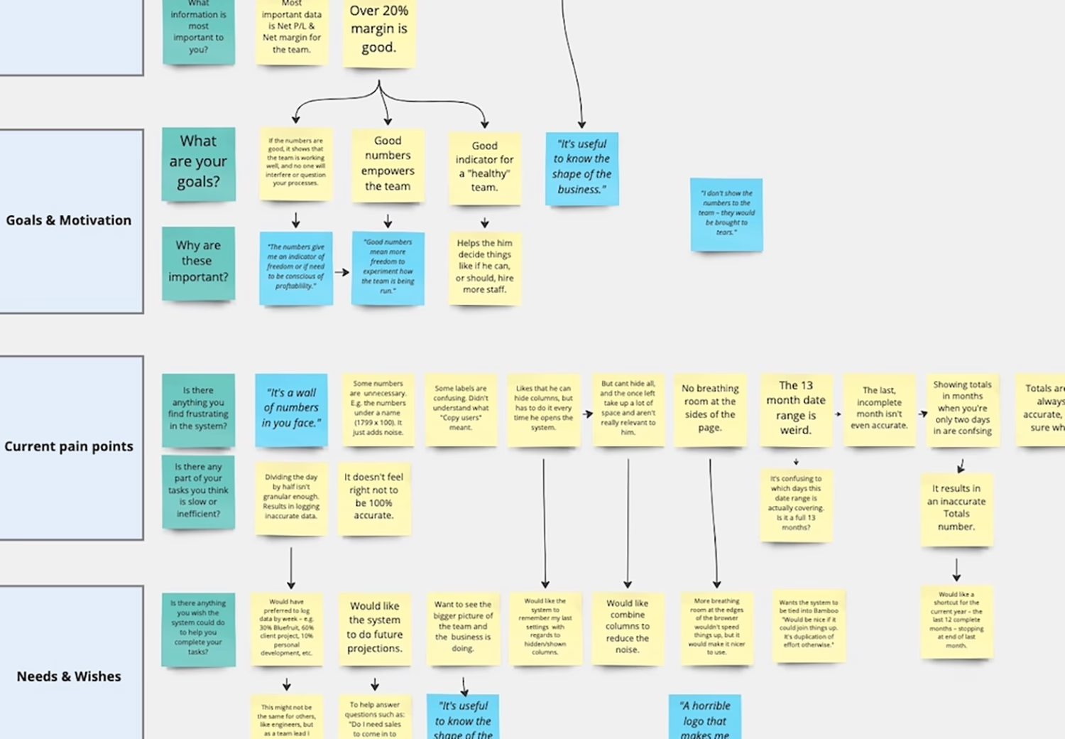
Notes from one of the interviews
While the research helped us identify and specify usability issues, we faced another challenge – with so many pain points and suggestions, we where uncertain about where to start. We needed a way to prioritise improvements effectively.
This is where usability tests provided clarity. We asked users to perform three of their most frequent tasks in the system and observed their interactions.
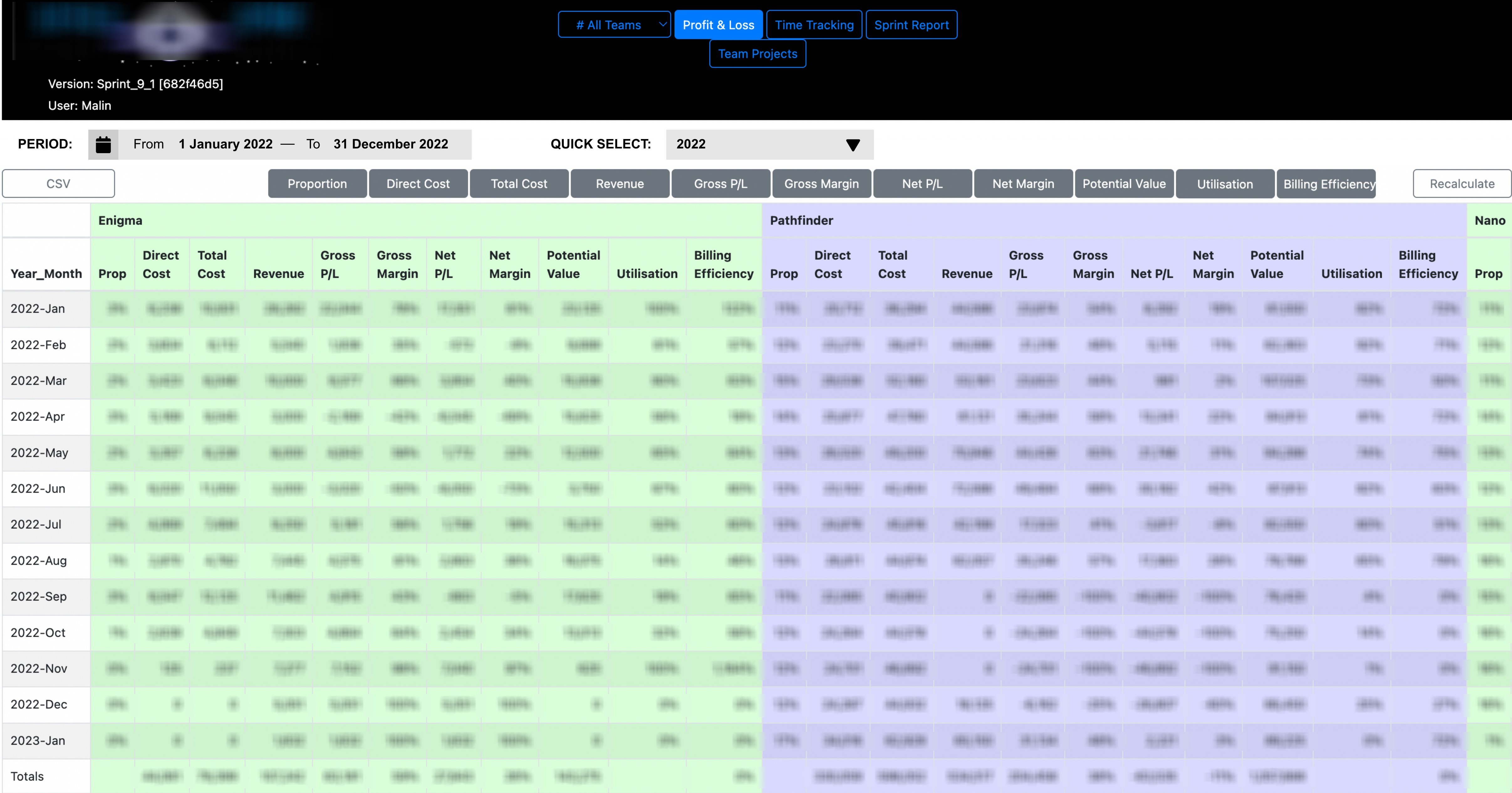
Through this, one issue emerged as particularly critical: the inefficient data retrieval process. The system lacked a filtering mechanism, forcing team leads and managers to manually sift through extensive datasets in order to collect the data they needed for the monthly reports and budgeting. This resulted in wasted time, frequent errors, and increased frustration.
The UX strategy: Prioritising features by impact
With only two weeks to improve the system, we needed to focus on the most impactful and feasible improvement. Using an impact-effort matrix, the product development team and I prioritised the usability issues and opportunities discovered in our research based on their user impact and implementation effort, to create an evidence-based backlog. Streamlining the data-entry process would have delivered significant user value, but was not feasible in a two week sprint. Improving the visual hierarchy did not deliver enough value to be prioritised at this state, so that ended up in the backlog as well. The highest-value improvement was clear: implementing a smart date filter would significantly streamline users workflow, increase productivity, and improve the user experience.
We designed a date-picker with a quick-select drop-down for commonly used time periods, and created a medium-fidelity prototype that we tested with users. This allowed us to refine the quick-select options, and ensure the design met their needs.

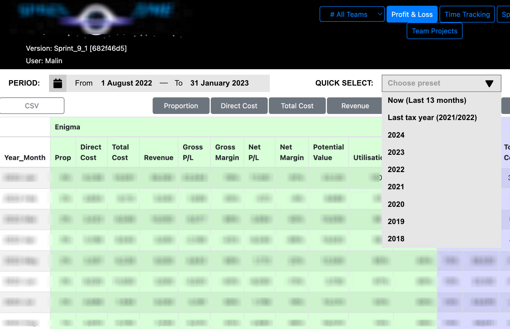
To ensure our design met user expectations, we created an interactive medium-fidelity prototype we could test and discuss with users.
The outcome: A dramatic reduction in time-on-task
By the end of the two-week sprint, the new filter was implemented and tested with users. The results were immediate and measurable:
✔ Time-on-task dropped from over five minutes to just seconds for common workflows.
✔ User satisfaction increased, with managers reporting less frustration and higher efficiency.
✔ System adoption rates improved, laying the groundwork for future UX-driven improvements.
User research: A smarter way to drive incremental system improvements
This case study highlights a key UX lesson: meaningful improvements don’t require a complete system overhaul. By leveraging user research to identify pain points and prioritise high-impact refinements, businesses can improve efficiency, productivity, and user satisfaction with minimal disruption and resources.